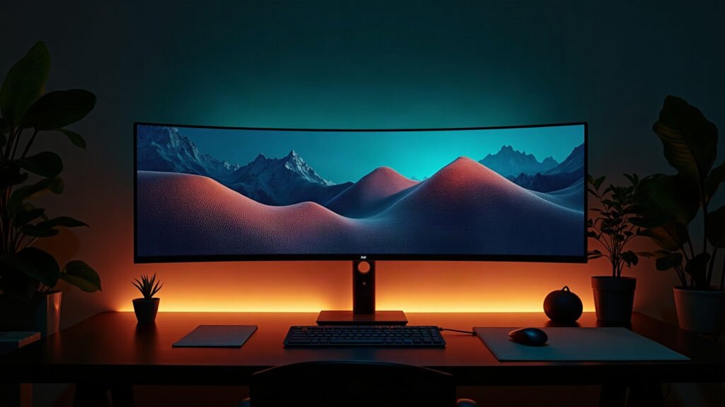
Scroll r/battlestations for ten minutes and you’ll notice something: most setups are the same setup. Black desk, black chair, RGB strip, one plant.
There’s nothing wrong with any of it — but if you want a desk that looks like yours, you need a point of view, not more lights.
How we pick
We judge a setup on three things: does it have one clear visual theme, is the cable situation solved, and is there one large surface tying the components together. Nearly every setup that looks ‘designed’ gets those three right.
The comparison
| Option | Best for | The catch |
|---|---|---|
| Pick one palette | Instant coherence | Means saying no to free RGB |
| One large desk surface | Ties mismatched gear together | Requires measuring first |
| Bias lighting, not floods | Depth on camera, less eye strain | Cheap strips have ugly colour |
| Vertical space (wall art, shelf) | Makes a desk look like a room | Needs commitment to a theme |
| Cable management | The single biggest ‘before/after’ | Genuinely tedious, worth it |
Winners by use case
A large mat is the cheapest way to make mismatched gear look like a set, because it gives everything one continuous background. Pick the theme here and let the rest follow: cyberpunk, deep space, or minimal abstract.
The wall above the monitor is the most-visible, least-used space in any setup. One or two prints in the same palette as your mat does more than another light strip. See the wall art →
Bias lighting behind the monitor, warm-neutral, dimmed. A good strip on 20% looks expensive; a cheap one on 100% looks like a gaming café.
FAQ
What’s the cheapest high-impact upgrade?
A large desk mat, then cable management, then bias lighting. In that order, every time.
How do I make a small desk look good?
Fewer, larger objects. A 24″ mat, one monitor on an arm, and nothing else on the surface.
Does wall art actually matter?
It’s the difference between ‘a desk in a room’ and ‘a setup’. It reads immediately on camera.
The part everyone skips
The reason most setups look generic is that every component was chosen separately, in a different month, on sale. Coherence is a decision, not a budget.
Pick a theme, make the biggest surface carry it, and keep the palette to two colours plus black. Start with the surface →
Leave a Reply